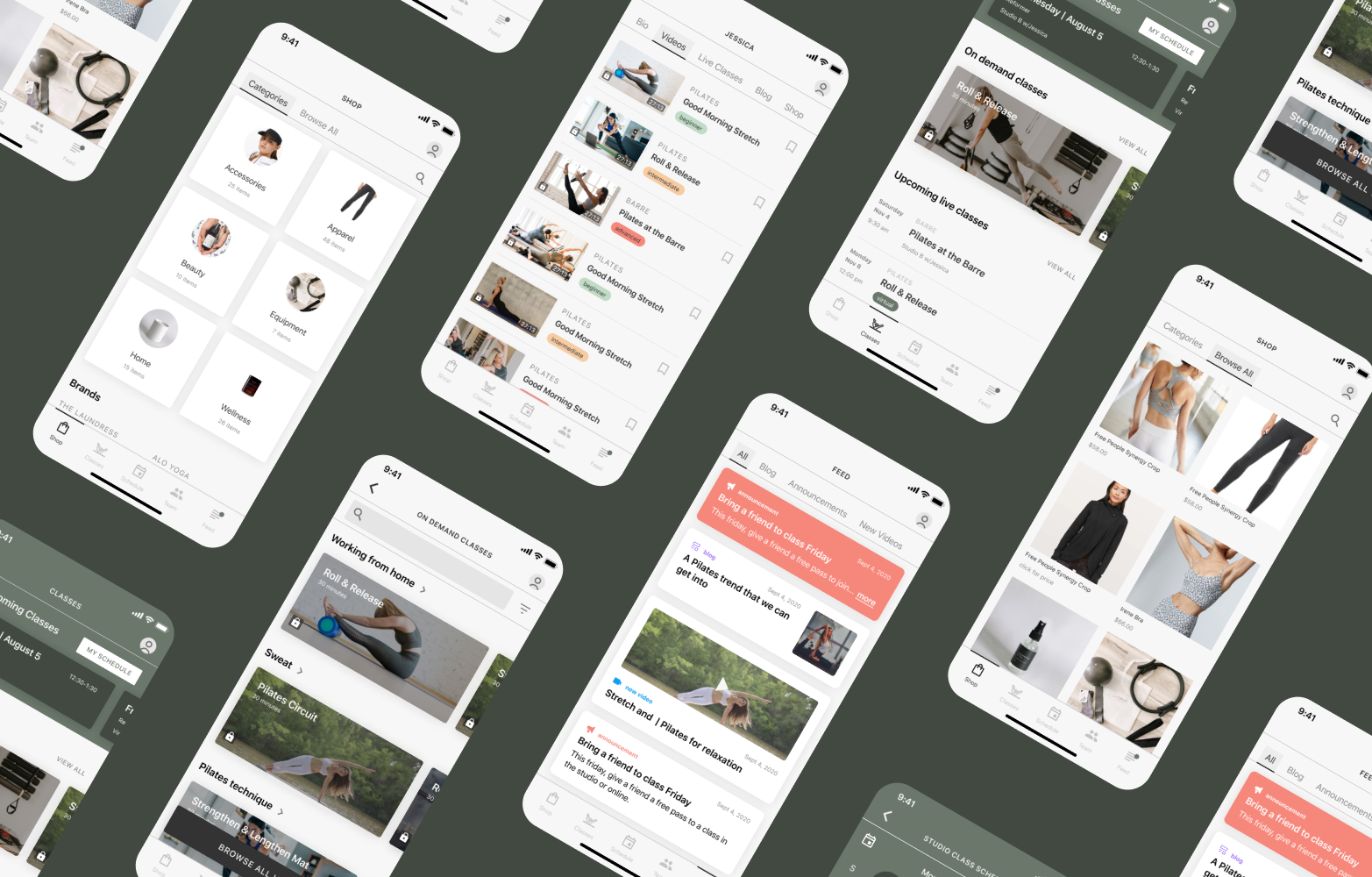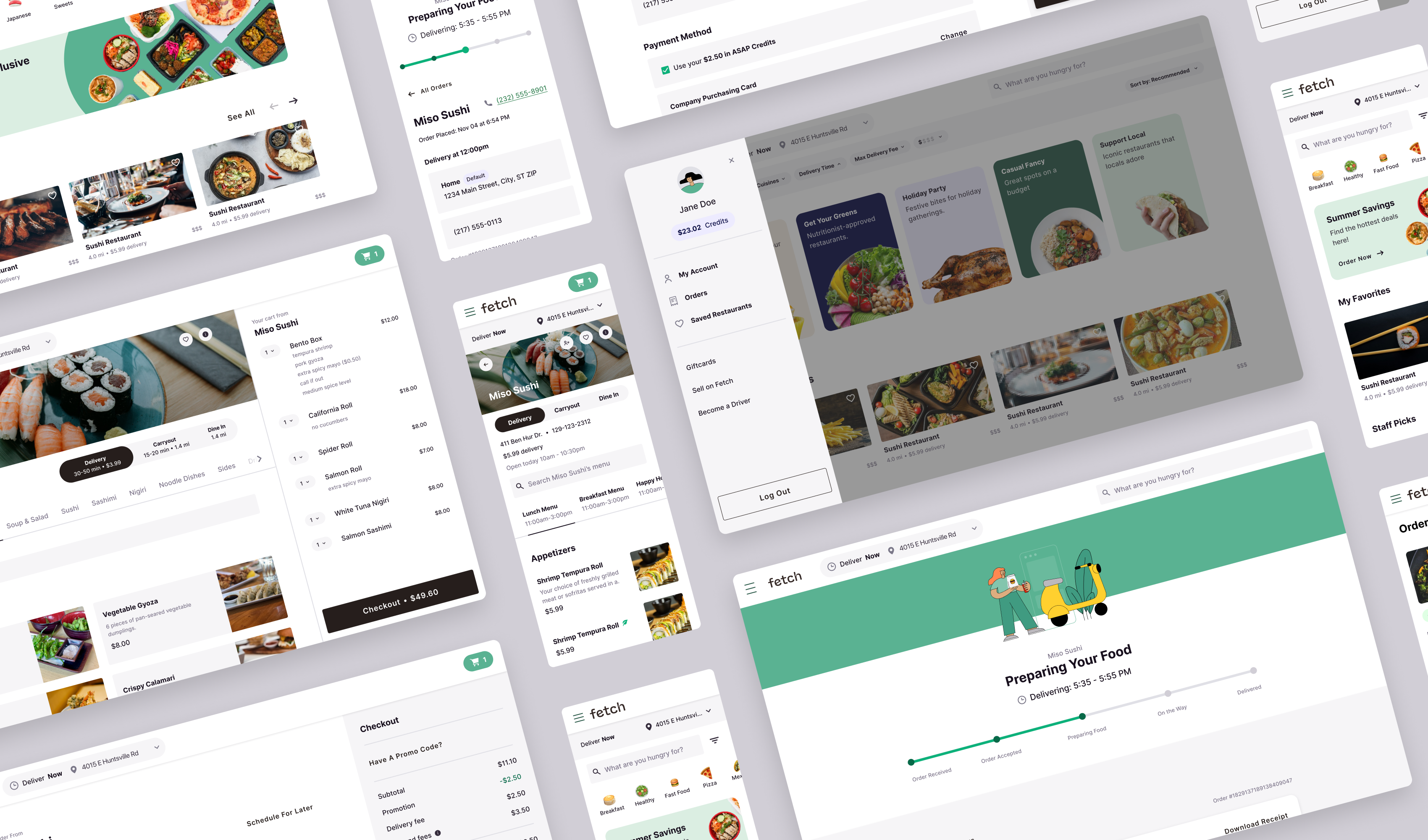
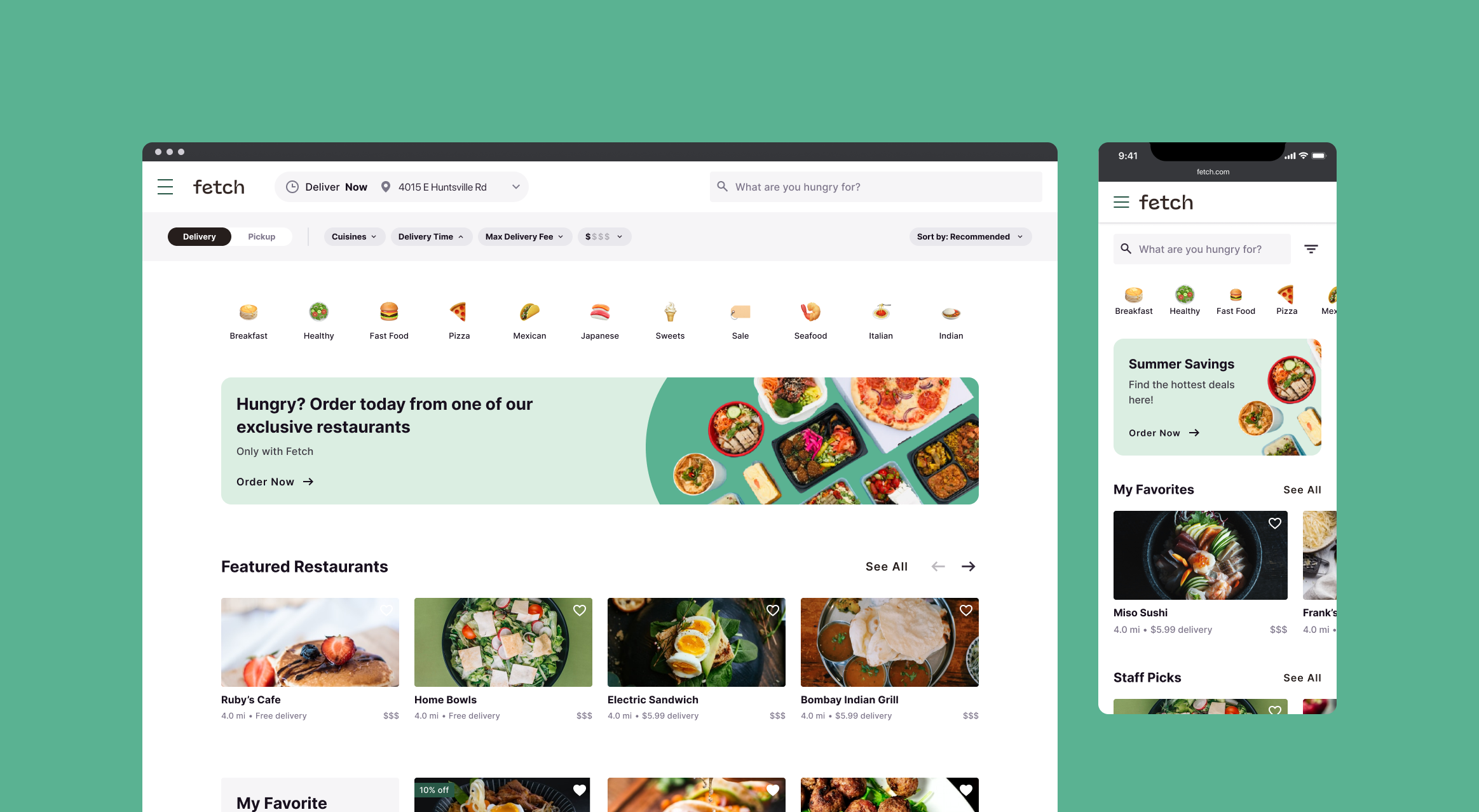
Our client, a company holding three food delivery brands, sought to build a theme-able, brand-able, responsive application to support all three brands. Myself and another designer created a clean base UI, compelling UX and a modular robust design system in order to support our client's needs.
Fetch is a self-created brand that was used as a base while designing the core user experience.
My team
Myself and another designer worked together to create the Fetch design ecosystem. Once designs were approved, we supported our team of front end and back end developers. We also worked closely with our product manager and test engineer to ensure alignment and quality throughout the product build.
Problem
Our client came to us in need of a new front end design to support the three different food delivery applications under their ownership. With the brand alignment of the three apps on the horizon, the client needed a modular and cohesive design and build to ensure scalability.
How might we create a compelling, modular, user experience and design system to support three brands.
Solution
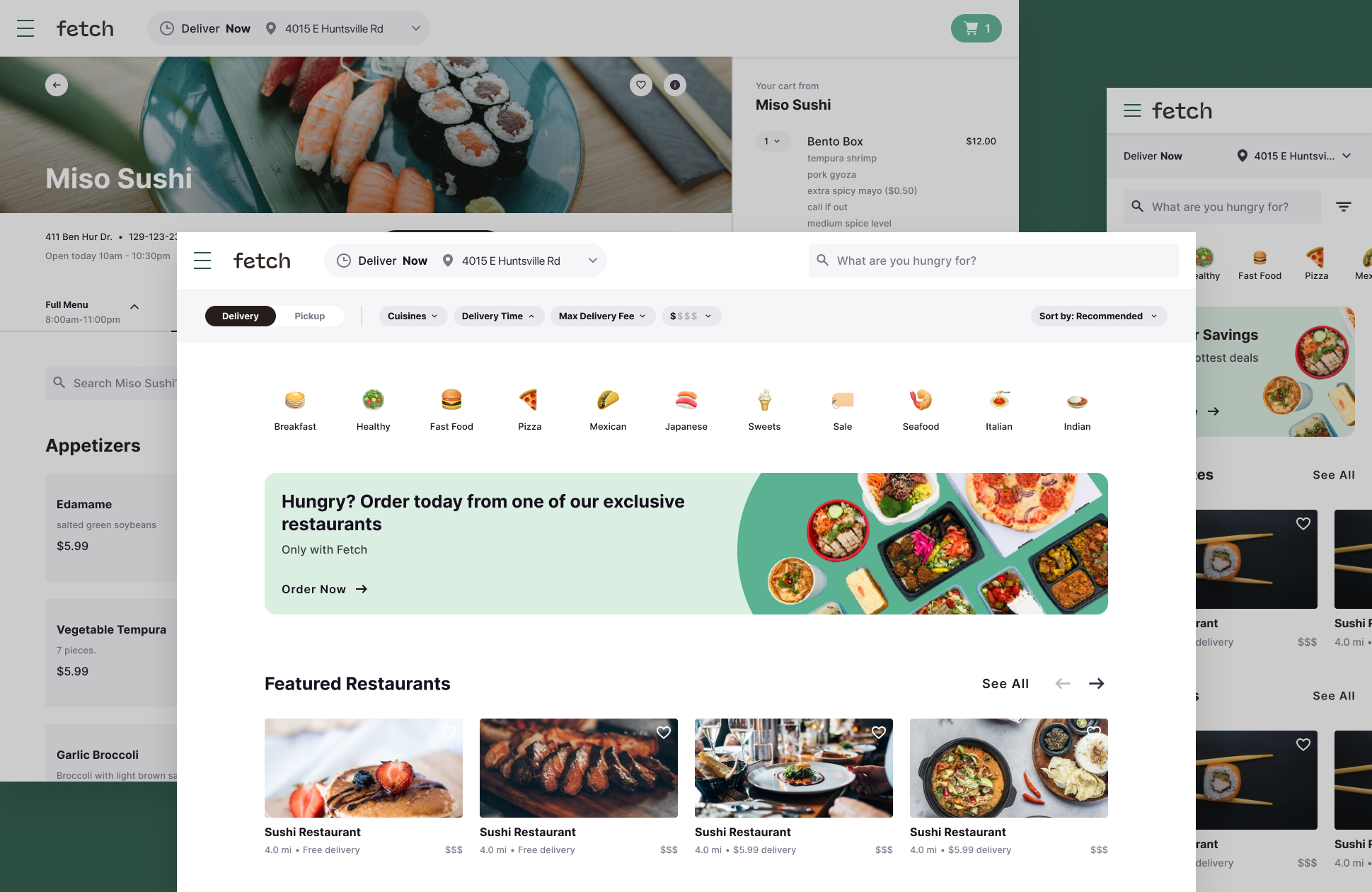
Over the 6 months allocated, my co-designer and I solved our clients needs by creating artifacts to support a successful product build and the future scalability of the company. We did so by creating:
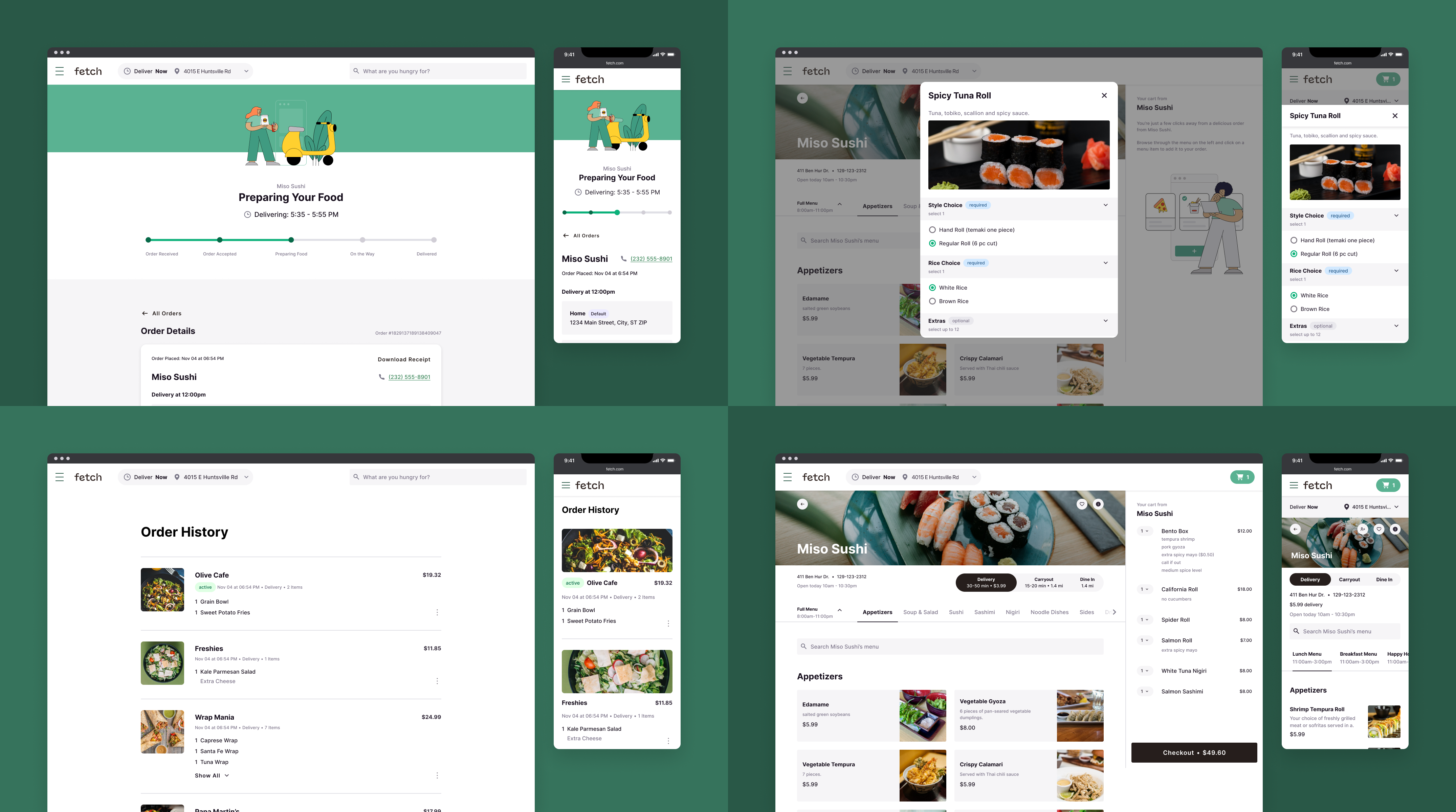
- An intuitive, modular, user experience that works across three brands and multiple combinations of feature sets.
- A robust design system in Figma that allows for switching between the various brands.
- We utilized Figma Design Tokens in JSON that we shared with our developers to support a similar theme switching capability in the site build.
.png)
User Experience
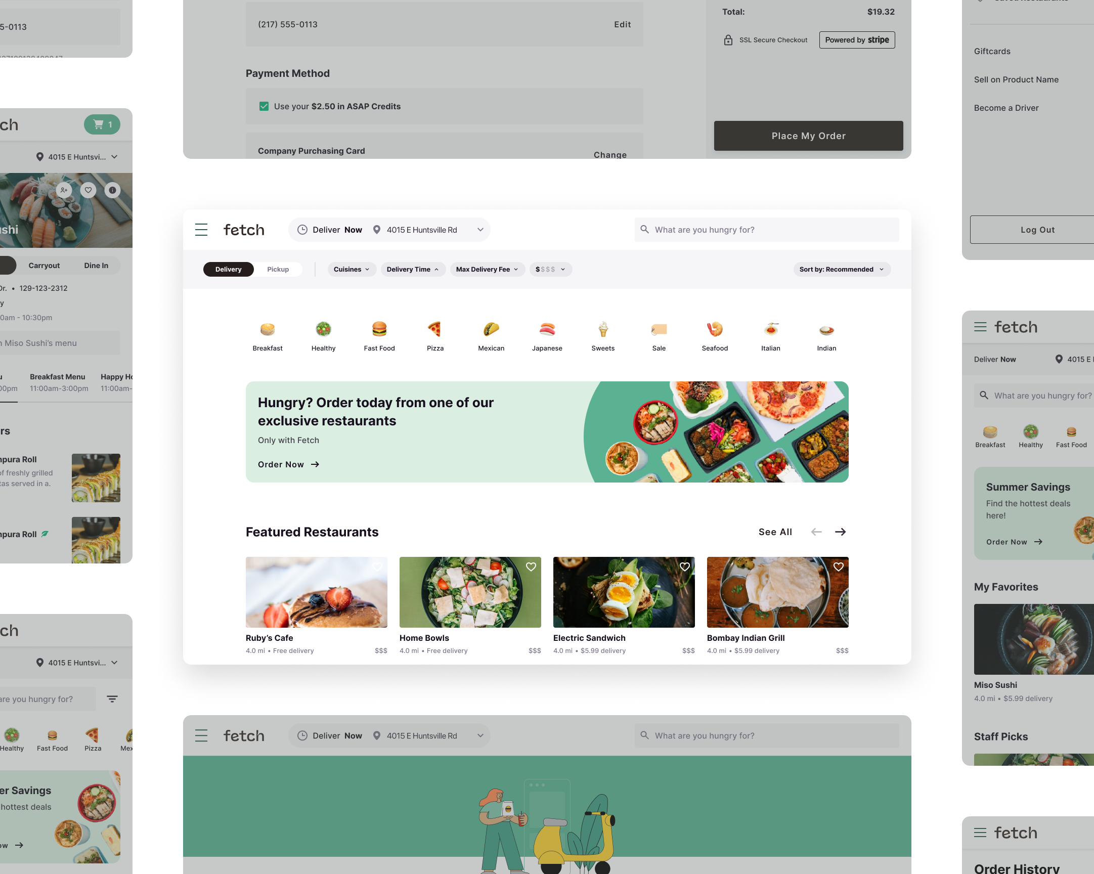
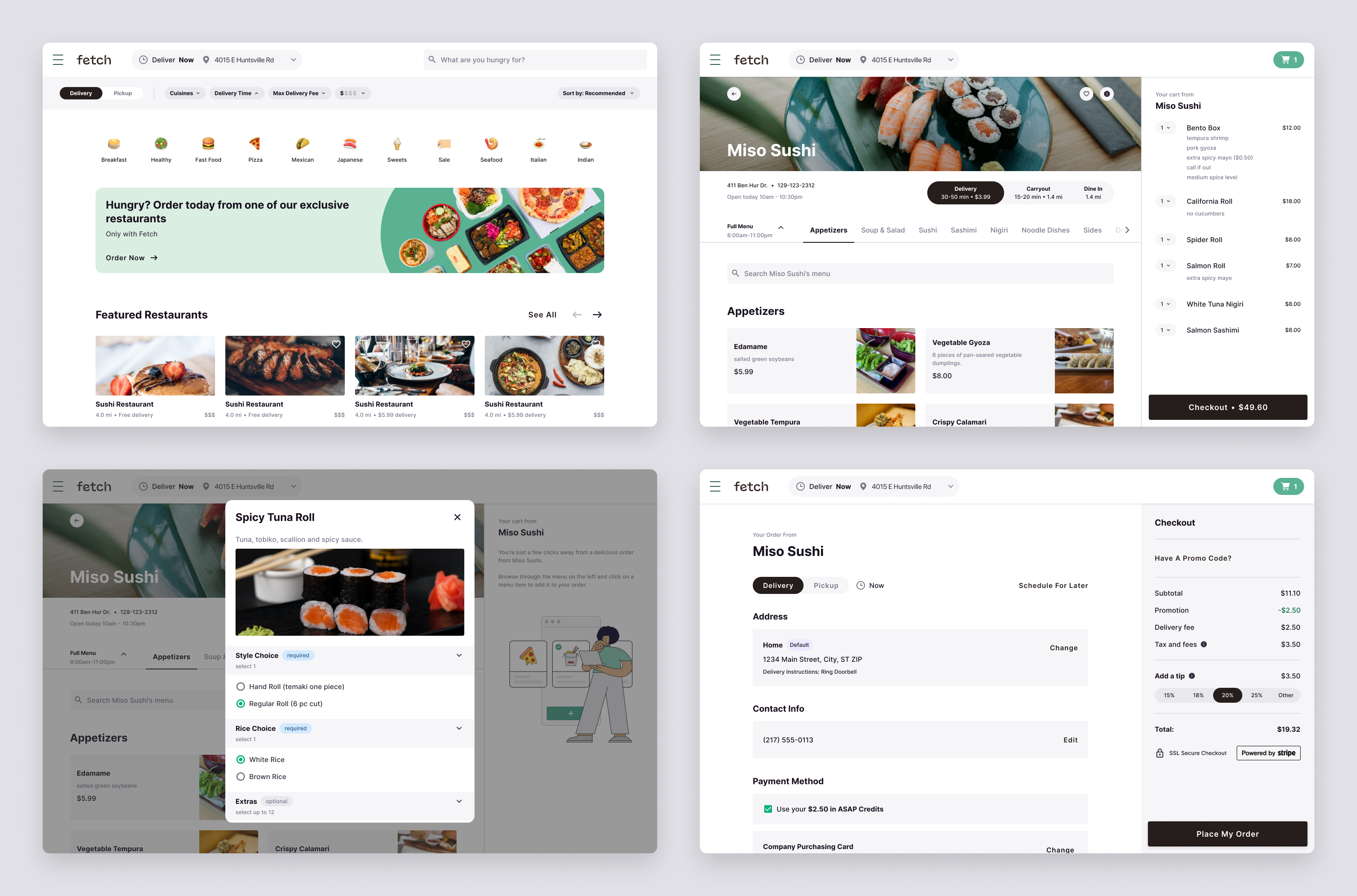
We designed a user experience to accommodate three different food delivery brands with different feature sets. We developed designs for every screen at mobile and desktop breakpoints while also documenting standards for every other breakpoint.
Design System
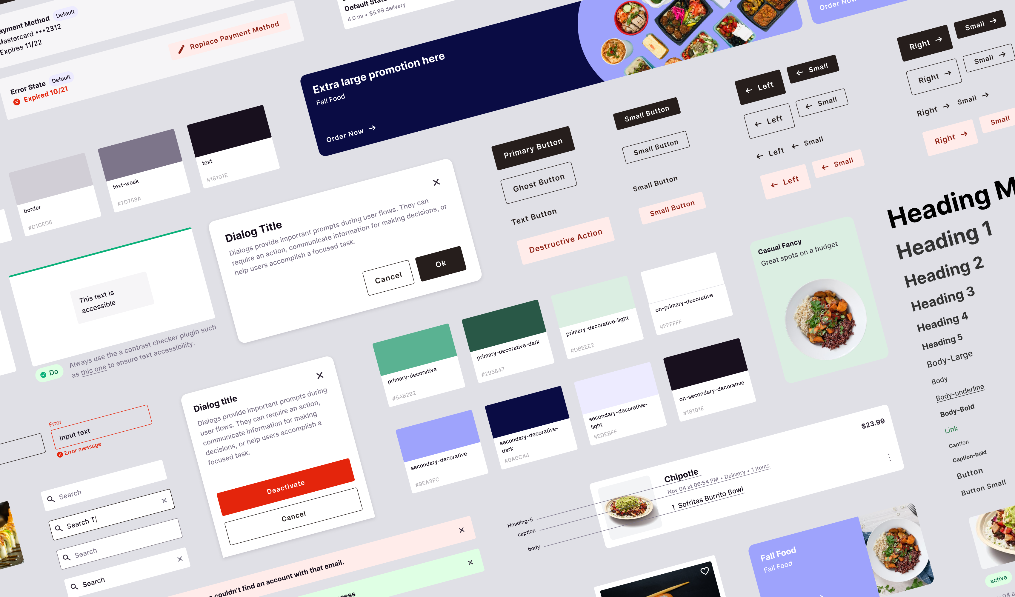
This design system posed a unique challenge of supporting three different brands for one single product interface and front-end build. To do this, we expanded the brand typography and color palette to be interchangeable in an accessible way. We stretched Figma to utilitize two plugins: Atlas Theme Switcher and Design Tokens. The former allowed us to switch between color, logo and type styles in Figma from one brand to the next. The design tokens allowed us to give our developers design token JSON output from Figma so they could implement a similar theme switcher.
Design System Documentation
Collaborating with the Development Team
This engagement presented the opportunity to rethink many of our processes as a team. We spent multiple weeks at the beginning setting up a foundational workflow and testing solutions to create an efficient, scalable and thorough workflow. Because of the complexity of the design system, a key priority for the product team was reducing the gap in communication between design and development. In order to do so, we shared design tokens in Figma through a JSON file to support a theme switching capability in the site build and ensure alignment between the design files and the developed product.

More Work